Animating Spatio-Temporal COVID-19 Data
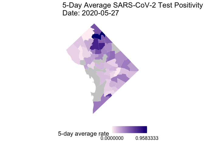 Image credit:
Ian Buller
Image credit:
Ian Buller
I present an update to my previous posts #1 and #2. This update can also be found on a public GitHub repository.
Starting May 17, 2020 the DC Mayoral Office began releasing testing information by neighborhood on their coronavirus data portal. Molly Tolzmann zmotoly added this feature to her publicly available Google Sheet presented at the DC health planning neighborhood level.
Here, I present the daily 5-day rolling average test positivity rate (TPR) for COVID-19 cases from May 25 to June 17, 2020 in an animated Graphics Interchange Format (GIF) using the open-source software language R. A TPR is the proportion of positive tests for every administered test. For example, the World Health Organization recommends a test positivity rate below 5% (1 out of 20 tests, TPR = 0.05) before reopening. A 5-day rolling average is the mean value of a daily TPR and the TPR of the four days prior.
Important Note: There are missing data for certain dates. Case information is missing for May 22nd and 27th. Testing information is missing for May 22nd, 23rd, 24th, and 27th. Missing data are considered NA but included in the 5-day rolling averages. Therefore, 5-day rolling averages that include these dates are more unstable. Because reporting case information at the
DC health planning neighborhood level became available on May 7th, daily incident case information is available starting May 8th and 5-day rolling average cases are available starting May 12th. Because testing information became available on May 20th, daily testing information is available starting May 21st and 5-day averages are available starting May 25th.
Necessary packages and settings for the exercise include:
# Packages
loadedPackages <- c("dplyr", "gganimate", "ggplot2", "googlesheets4", "sf", "tidyr", "transformr")
invisible(lapply(loadedPackages, require, character.only = T))

# Settings
gs4_deauth() # no Google authorization necessary because we are not reading a public repo
Data Importation
I merge the District of Columbia Health Planning Neighborhoods boundaries and Molly Tolzmann’s zmotoly collation of the cumulative cases and tests from start of the SARS-CoV-2 outbreak. I clean up variable names that are easier for R to use.
# District of Columbia Health Planning Neighborhoods
gis_path <- "https://opendata.arcgis.com/datasets/de63a68eb7674548ae0ac01867123f7e_13.geojson"
dc <- st_read(gis_path)
## Reading layer `DC_Health_Planning_Neighborhoods' from data source
##   `https://opendata.arcgis.com/datasets/de63a68eb7674548ae0ac01867123f7e_13.geojson'
##   using driver `GeoJSON'
## Simple feature collection with 51 features and 9 fields
## Geometry type: POLYGON
## Dimension:     XY
## Bounding box:  xmin: -77.11976 ymin: 38.79165 xmax: -76.9094 ymax: 38.99556
## Geodetic CRS:  WGS 84
# District of Columbia SAR-CoV-2 Data prepared by @zmotoly
covid_path <- "https://docs.google.com/spreadsheets/d/1u-FlJe2B1rYV0obEosHBks9utkU30-C2TSkHka6AVS8/edit#gid=1923705378"
covid <- read_sheet(
  ss = covid_path,
  sheet = 2, # second sheet
  skip = 2
)  # skip 1st row of annotation

# Fix column names
names(covid) <- sub("\n", "", names(covid)) # remove extra line in column names
names(covid) <- gsub(" ", "_", names(covid)) # replace spaces with underscore
names(covid) <- gsub("Total_cases", "Cumulative", names(covid)) # Change to one word
names(covid) <- gsub("Total_tests", "Tested_", names(covid)) # Change to one word
names(covid) <- gsub("Cases_per_1000", "Case.Rate", names(covid)) # Change to one word
names(covid) <- gsub("Tests_per_1000", "Test.Rate_", names(covid)) # Change to one word
names(covid) <- gsub("__", "_", names(covid)) # replace double underscores

# Merge
dc_covid <- left_join(dc, covid, by = join_by("CODE" == "NB_Code"))

# Spatial Projection
## UTM zone 18N (Washington, DC)
dc_covid_proj <- st_transform(dc_covid, crs = 32618)
Data Management
The 5-day rolling average test positivity rate is not provided in Molly Tolzmann’s zmotoly Google Sheet and I calculate it for every day data are available. First, I find the daily incident cases from the reported cumulative cases.
# Uses ggplot2 package
## helpful material: https://cengel.github.io/rspatial/4_Mapping.nb.html

# Step 1) Daily incident cases
CoV_DC_loop <- dc_covid_proj %>%
  select(starts_with("cumulative")) %>%
  st_drop_geometry()
CoV_DC_loop <- CoV_DC_loop[, rev(1:length(CoV_DC_loop))] # reorder dates in ascending order
CoV_DC_loop$Cumulative_May_22 <- NA # missing data
CoV_DC_loop$Cumulative_May_27 <- NA # missing data
CoV_DC_loop$Cumulative_Jun_8 <- NA # missing data
CoV_DC_loop$Cumulative_Jun_10 <- NA # missing data
CoV_DC_loop <- CoV_DC_loop[, c(1:15, 39, 16:19, 40, 20:30, 41, 31, 42, 32:38)] # reorder for consistent dates
i <- NULL # initiate indexing

# Empty matrices
mat_inc <- matrix(ncol = length(CoV_DC_loop)-1, nrow = nrow(CoV_DC_loop)) # for values
col_lab <- vector(mode = "character", length = length(CoV_DC_loop)-1)     # for names

for (i in 1:length(CoV_DC_loop)-1) {
  mat_inc[ , i] <- ifelse(
    CoV_DC_loop[ , i+1] - CoV_DC_loop[ , i] < 0,
    NA,
    CoV_DC_loop[ , i+1] - CoV_DC_loop[ , i]
  )
  col_lab[i] <- paste(
    sub("Cumulative", names(CoV_DC_loop[i+1]), replacement = "incident")
  )
  if(i == length(CoV_DC_loop))
    mat_inc <- data.frame(mat_inc)
    colnames(mat_inc) <- col_lab
}

CoV_DC_df <- cbind(dc_covid_proj, mat_inc) # merge with original dataset
Then I calculate 5-day rolling average cases (rate included, too).
# Step 2) 5-Day Average Incident Case and Case Rate
CoV_DC_loop <-  CoV_DC_df %>%
  select(starts_with("incident")) %>%
  st_drop_geometry()
i <- NULL # reinitiate indexing

# Empty matrices
mat_5d <- matrix(ncol = length(CoV_DC_loop)-4, nrow = nrow(CoV_DC_loop)) # for values
mat_5dr <- matrix(ncol = length(CoV_DC_loop)-4, nrow = nrow(CoV_DC_loop)) # for values
col_lab <- vector(mode = "character", length = length(CoV_DC_loop)-4)     # for names
col_labr <- vector(mode = "character", length = length(CoV_DC_loop)-4)    # for names

for (i in 1:(length(CoV_DC_loop)-4)) {
  mat_5d[ , i] <- rowMeans(CoV_DC_loop[ , i:(i+4)], na.rm = T)
  mat_5dr[ , i] <-  mat_5d[ , i] / CoV_DC_df$Population_.2018_ACS. * 1000
  col_lab[i] <- paste(sub("incident", names(CoV_DC_loop[(i+4)]), replacement = "average"))
  col_labr[i] <- paste(sub("incident", names(CoV_DC_loop[(i+4)]), replacement = "average.rate"))
  if(i == (length(CoV_DC_loop)-4))
    mat_5d <- data.frame(mat_5d)
    mat_5dr <- data.frame(mat_5dr)
    colnames(mat_5d) <- col_lab
    colnames(mat_5dr) <- col_labr
    out <- cbind(mat_5d, mat_5dr)
}

CoV_DC_df <- cbind(CoV_DC_df, out) # merge with original dataset
I also find the daily tests administered from the reported cumulative tests (daily test positivity rate included, too), and hen I calculate a 5-day rolling average tests.
# Step 3) Daily Tests
CoV_DC_loop <- CoV_DC_df %>%
  select(starts_with("Tested"), starts_with("incident")) %>%
  st_drop_geometry()
CoV_DC_loop <- CoV_DC_loop[,c(rev(1:23), 36:64)]   # reorder dates in ascending order
CoV_DC_loop$Tested_May_22 <- NA # missing data
CoV_DC_loop$Tested_May_23 <- NA # missing data
CoV_DC_loop$Tested_May_24 <- NA # missing data
CoV_DC_loop$Tested_May_27 <- NA # missing data
CoV_DC_loop$Tested_Jun_9 <- NA  # missing data
CoV_DC_loop$Tested_Jun_10 <- NA # missing data
CoV_DC_loop <- CoV_DC_loop[,c(1:2, 53:55, 3:4, 56, 5:16, 57:58, 17:52)] # reorder for consistent dates
i <- NULL # reinitiate indexing

# Empty matrices
mat_inc <- matrix(ncol = length(CoV_DC_loop)/2-1, nrow = nrow(CoV_DC_loop))  # for values
mat_inc2 <- matrix(ncol = length(CoV_DC_loop)/2-1, nrow = nrow(CoV_DC_loop)) # for values
col_lab <- vector(mode = "character", length = length(CoV_DC_loop)/2-1)      # for names
col_lab2 <- vector(mode = "character", length = length(CoV_DC_loop)/2-1)     # for names

for (i in 1:(length(CoV_DC_loop)/2-1)) {
  mat_inc[ , i] <- ifelse(
    CoV_DC_loop[ , (i+1)] - CoV_DC_loop[ , i] < 0,
    NA,
    CoV_DC_loop[ , (i+1)] - CoV_DC_loop[ , i]
  )
  mat_inc2[ , i] <-  CoV_DC_loop[ , (length(CoV_DC_loop)/2+i)] / mat_inc[ , i]
  col_lab[i] <- paste(sub("Tested", names(CoV_DC_loop[i+1]), replacement = "testing"))
  col_lab2[i] <- paste(sub("Tested", names(CoV_DC_loop[i+1]), replacement = "positivity"))
  if(i == (length(CoV_DC_loop)/2-1))
    mat_inc <- data.frame(mat_inc)
    mat_inc2 <- data.frame(mat_inc2)
    colnames(mat_inc) <- col_lab
    colnames(mat_inc2) <- col_lab2
    out <- cbind(mat_inc, mat_inc2)
}

CoV_DC_df <- cbind(CoV_DC_df, out) # merge with original dataset
A 5-day rolling average test positivity is calculated by dividing the 5-day rolling average cases by the 5-day rolling average tests.
# Step 4) 5-day average testing and positivity
CoV_DC_loop <-  CoV_DC_df %>%
  select(starts_with("testing_"), starts_with("average_")) %>%
  st_drop_geometry()
CoV_DC_loop <- CoV_DC_loop[, -c(29:37)]   # restrict to dates with testing
i <- NULL # reinitiate indexing

# Empty matrices
mat_5d <- matrix(ncol = 28-4, nrow = nrow(CoV_DC_loop))  # for values
mat_5dr <- matrix(ncol = 28-4, nrow = nrow(CoV_DC_loop)) # for values
col_lab <- vector(mode = "character", length = 28-4)     # for names
col_labr <- vector(mode = "character", length = 28-4)    # for names

for (i in 1:(28-4)) {
  mat_5d[ , i] <- rowMeans(CoV_DC_loop[ , i:(i+4)], na.rm = T)
  mat_5dr[ , i] <-  CoV_DC_loop[ , 28+i] / mat_5d[ , i]
  col_lab[i] <- paste(sub("testing", names(CoV_DC_loop[(i+4)]), replacement = "test.avg"))
  col_labr[i] <- paste(sub("testing", names(CoV_DC_loop[(i+4)]), replacement = "posit.avg"))
  if(i == (28-4))
    mat_5d <- data.frame(mat_5d)
    mat_5dr <- data.frame(mat_5dr)
    colnames(mat_5d) <- col_lab
    colnames(mat_5dr) <- col_labr
    out <- cbind(mat_5d, mat_5dr)
}

CoV_DC_df <- cbind(CoV_DC_df, out) # merge with original dataset

# Conserve memory
rm(out, col_lab, col_labr, CoV_DC_loop, mat_5d, mat_5dr, mat_inc, mat_inc2)
I use the ggplot2 and gganimate packages to create a GIF of the daily 5-day rolling average TPR for COVID-19 cases from May 25 to June 17, 2020. The packages require converting the data from wide- to long-format.
# Convert to long format
CoV_DC_5dtest <-  CoV_DC_df %>%
  select(1:25, starts_with("posit.avg")) %>%
  pivot_longer(
    cols = starts_with("posit.avg"),
    values_to = "posit.avg",
    names_to = c("Posit.Avg", "month", "day"),
    names_sep = "_"
  ) %>%
  unite("date_reported", month:day) %>%
  select(-Posit.Avg) %>%
  mutate(date_reported = as.Date(date_reported, format="%B_%d"))
Finally, some 5-day rolling average TPR are invalid for two possible reasons. If any district had zero (0) administered tests, then the TPR (a ratio) would be undefined. Also, if there were more reported positive cases than administered tests (e.g., reporting backlog) then the TPR would be above one (1.0). In these cases, I present these instances as NA values.
# Clean-up
## Any Inf values (zero tests in denominator) set as NA
CoV_DC_5dtest$posit.avg <- ifelse(
  is.infinite(CoV_DC_5dtest$posit.avg), NA, CoV_DC_5dtest$posit.avg
)

## Any values above 1.0 (more positive tests than werer administered) set as NA
CoV_DC_5dtest$posit.avg <- ifelse(
  CoV_DC_5dtest$posit.avg > 1, NA, CoV_DC_5dtest$posit.avg
)
Animated Map
The following is the code to create a GIF of the daily 5-day rolling average TPR for COVID-19 cases from May 25 to June 17, 2020. I chose
non-alarmist colors similar to previous posts
#1 and
#2. Grey-colored areas have missing (NA) or no information.
# 5-day average test positivity
g1 <- CoV_DC_5dtest %>%                   # data
  ggplot() +                              # initial plot
  geom_sf(
    aes(fill = posit.avg),
    color = NA
  ) +                                     # add polygons
  scale_fill_gradient(
    name = "5-day average rate",          # color fill
    low = "lavenderblush",
    high = "navyblue",
    na.value = "grey80",
    breaks = range(CoV_DC_5dtest$posit.avg, na.rm = T)
  ) +
  theme_void() +
  theme(
    plot.margin = margin(t = 20, r = 50, b = 40, l = 10, unit = "pt"),
    legend.position = "bottom",           # legend position
    text = element_text(size = 10)        # set font size
  ) +
  coord_sf() +                            # force equal dimensions
  transition_time(date_reported) +        # animate by date
  labs(
    title = "5-Day Average SARS-CoV-2 Test Positivity\nDate: {frame_time}"
  )                                       # add title

animate(g1, end_pause = 30)               # animate
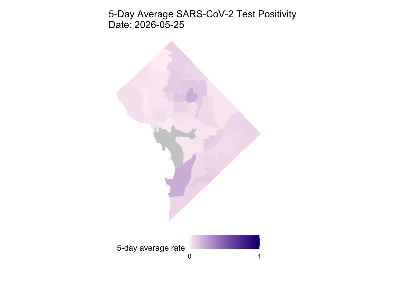
Overall, my qualitative assessment of the daily 5-day rolling average TPR for COVID-19 cases from May 25 to June 17, 2020 is a decrease in TPR overtime, especially after June 3rd. Ward 4 (Northern-most section) appears to have consistently high 5-day rolling average TPR overtime.
The provided maps are not intended to inform decision-making. Instead, I provide the the open-source code to download, manage, and visualize publicly available data. Future steps (in addition to one listed in my previous post) include, displaying TPR above or below the the 5% WHO recommendation and conducting spatial statistical analysis such as, for example, assessing the presence of spatio-temporal clustering. Other values (e.g., daily TPR, incident cases per 1,000) can be animated by modifying the above code, which is also provided in my public GitHub repository.
Thanks, again, to Molly Tolzmann zmotoly for the data collation, management, and custodianship.
Ian Buller, PhD, MA
Epidemiologist
I am a (geo)spatial statistician & environmental epidemiologist who primarily codes in R • All content is my own and does not represent my employer • he/him/his