Test Positivity Rate of Cumulative SARS-CoV-2 Cases in the District of Columbia
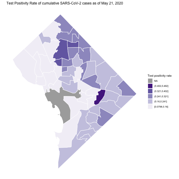 Image credit:
Ian Buller
Image credit:
Ian Buller
I present an update to my previous post. Starting May 17, 2020 the DC Mayoral Office began releasing testing information by neighborhood on their coronavirus data portal. Molly Tolzmann zmotoly added this feature to her publicly available Google Sheet presented at the DC health planning neighborhood level. The update here can also be found on a public GitHub repository.
Here, I present the test positivity rate (TPR) for cumulative COVID-19 cases as of May 21, 2020. A TPR is the proportion of positive tests for every administered test. For example, the World Health Organization recommends a test positivity rate below 5% (1 out of 20 tests, TPR = 0.05) before reopening.
Important Note: The following show cumulative case rate per 1,000 since the beginning of the COVID-19 outbreak in DC. Therefore, the the stats do not reflect the number of people currently infected with SARS-CoV-2.
Necessary packages and settings for the exercise include:
# Packages
loadedPackages <- c("dplyr", "ggplot2", "googlesheets4", "leaflet", "sf", "stringr", "widgetframe")
invisible(lapply(loadedPackages, require, character.only = T))

# Settings
gs4_deauth() # no Google authorization necessary because we are not reading a public repo
I merged the District of Columbia
Health Planning Neighborhoods boundaries and Molly Tolzmann’s
zmotoly
collation of the cumulative cases and tests from start of the SARS-CoV-2 outbreak. I created a new variable for the test positivity rate test_positivity_May_21.
# District of Columbia Health Planning Neighborhoods
gis_path <- "https://opendata.arcgis.com/datasets/de63a68eb7674548ae0ac01867123f7e_13.geojson"
dc <- st_read(gis_path)
## Reading layer `DC_Health_Planning_Neighborhoods' from data source
##   `https://opendata.arcgis.com/datasets/de63a68eb7674548ae0ac01867123f7e_13.geojson'
##   using driver `GeoJSON'
## Simple feature collection with 51 features and 9 fields
## Geometry type: POLYGON
## Dimension:     XY
## Bounding box:  xmin: -77.11976 ymin: 38.79165 xmax: -76.9094 ymax: 38.99556
## Geodetic CRS:  WGS 84
# District of Columbia SAR-CoV-2 Data prepared by @zmotoly
covid_path <- "https://docs.google.com/spreadsheets/d/1u-FlJe2B1rYV0obEosHBks9utkU30-C2TSkHka6AVS8/edit#gid=1923705378"
covid <- read_sheet(
  ss = covid_path,
  sheet = 2, # second sheet
  skip = 2 # skip 1st row of annotation
)
names(covid) <- sub("\n", "", names(covid))   # remove extra line in column names
names(covid) <- gsub(" ", "_", names(covid))  # replace spaces with underscore

# Test Positivity Rate
covid$test_positivity_May_21 <- covid$Total_cases_May_21 / covid$Total_tests_May_21

# Merge
dc_covid <- left_join(dc, covid, by = join_by("CODE" == "NB_Code"))

# Spatial Projection
## UTM zone 18N (Washington, DC)
dc_covid_proj <- st_transform(dc_covid, crs = 32618)
Static Map
I use the ggplot2 package to plot the test positivity rate (as of May 21).
# Uses ggplot2 package
## helpful material: https://cengel.github.io/rspatial/4_Mapping.nb.html
## Plot of cumulative cases per 1,000
ggplot() +                                                # initialize ggplot object
  geom_sf(                                                # make a polygon
    data = dc_covid_proj,                                     # data frame
    aes(fill = cut_interval(test_positivity_May_21, 5)),  # variable to use for filling
    colour = "white"
  ) +                                     # color of polygon borders
  scale_fill_brewer(
    "Test positivity rate",               # title of colorkey
    palette = "Purples",                  # fill with brewer colors
    na.value = "grey67",                  # color for NA (The National Mall)
    direction = 1,                        # reverse colors in colorkey
    guide = guide_legend(reverse = T)     # reverse order of colokey
  ) +
  ggtitle(
    "Test Positivity Rate of cumulative SARS-CoV-2 cases as of May 21, 2020"
  ) +                                     # add title
  theme(
    line = element_blank(),               # remove axis lines
    axis.text = element_blank(),          # remove tickmarks
    axis.title = element_blank(),         # remove axis labels
    panel.background = element_blank(),   # remove background gridlines
    text = element_text(size = 10)
  ) +                                     # set font size
  coord_sf()                              # both axes the same scale
And an interactive map with the leaflet package.
# Work with unprojected spatialpolygonsdataframe
## Project to WGS84 EPSG:4326
CoV_DC_WGS84 <- st_transform(dc_covid_proj, crs = 4326)

## Create Popups
dc_health <- str_to_title(CoV_DC_WGS84$Neighborhood_Name)
dc_health[c(11, 25, 41, 49)] <- c(
  "DC Medical Center", "GWU", "National Mall", "SW/Waterfront"
)
CoV_DC_WGS84$popup1 <- paste(
  dc_health,
  ": ",
  format(round(CoV_DC_WGS84$Total_cases_May_21, digits = 0), big.mark = ",", trim = T),
  " cumulative cases",
  sep = ""
)
CoV_DC_WGS84$popup2 <- paste(
  dc_health,
  ": ",
  format(round(CoV_DC_WGS84$Cases_per_1000_May_21, digits = 0), big.mark = ",", trim = T),
  " cumulative cases per 1,000",
  sep = ""
)
CoV_DC_WGS84$popup3 <- paste(
  dc_health,
  ": ",
  format(round(CoV_DC_WGS84$test_positivity_May_21, digits = 2), big.mark = ",", trim = T),
  " test positivity rate",
  sep = ""
)

## Set Palettes
pal_cum <- colorNumeric(
  palette = "Purples", domain = CoV_DC_WGS84$Total_cases_May_21, na.color = "#555555"
)
pal_rate <- colorNumeric(
  palette = "Purples", domain = CoV_DC_WGS84$Cases_per_1000_May_21, na.color = "#555555"
)
pal_test <- colorNumeric(
  palette = "Purples", domain = CoV_DC_WGS84$Tests_per_1000_May_21, na.color = "#555555"
)
pal_weight <- colorNumeric(
  palette = "Purples", domain = CoV_DC_WGS84$test_positivity_May_21, na.color = "#555555"
)

## Create leaflet plot
lf <- leaflet(CoV_DC_WGS84) %>%                        # initial data
  setView(lng = -77, lat = 38.9, zoom = 11) %>%                  # starting coordinates
  addTiles() %>% # basemap
  addPolygons(
    data = CoV_DC_WGS84,
    color = "black",
    weight = 1,
    smoothFactor = 0.5,
    opacity = 1,
    fillOpacity = 0.67,
    fillColor = ~pal_cum(Total_cases_May_21),
    popup = ~popup1,
    highlightOptions = highlightOptions(color = "white", weight = 2, bringToFront = TRUE),
    group = "Cases"
  ) %>%
  addPolygons(
    data = CoV_DC_WGS84,
    color = "black",
    weight = 1,
    smoothFactor = 0.5,
    opacity = 1,
    fillOpacity = 0.67,
    fillColor = ~pal_rate(Cases_per_1000_May_21),
    popup = ~popup2,
    highlightOptions = highlightOptions(color = "white", weight = 2, bringToFront = TRUE),
    group = "Cases per 1,000"
  ) %>%
  addPolygons(
    data = CoV_DC_WGS84,
    color = "black",
    weight = 1,
    smoothFactor = 0.5,
    opacity = 1,
    fillOpacity = 0.67,
    fillColor = ~pal_test(Tests_per_1000_May_21), popup = ~popup3,
    highlightOptions = highlightOptions(color = "white", weight = 2, bringToFront = TRUE),
    group = "Tests per 1,000"
  ) %>%
  addPolygons(
    data = CoV_DC_WGS84,
    color = "black",
    weight = 1,
    smoothFactor = 0.5,
    opacity = 1,
    fillOpacity = 0.67,
    fillColor = ~pal_weight(test_positivity_May_21),
    popup = ~popup3,
    highlightOptions = highlightOptions(color = "white", weight = 2, bringToFront = TRUE),
    group = "Test positivity rate"
  ) %>%
  addLayersControl(
    overlayGroups = c(
      "Cases", "Cases per 1,000", "Tests per 1,000", "Test positivity rate"
    ), # layer selection
    options = layersControlOptions(collapsed = FALSE)
  ) %>%
  addLegend(
    "topright",
    pal = pal_cum,
    values = ~Total_cases_May_21,                  # legend for cases
    title = "Cumulative COVID-19 cases",
    opacity = 1,
    na.label = "No Data",
    group = "Cases"
  ) %>%
  addLegend(
    "topright",
    pal = pal_rate,
    values = ~Cases_per_1000_May_21,              # legend for rate
    title = "Cumulative cases per 1,000",
    opacity = 1,
    na.label = "No Data",
    group = "Cases per 1,000"
  ) %>%
  addLegend(
    "topright",
    pal = pal_test,
    values = ~Tests_per_1000_May_21,              # legend for test positivity rate
    title = "Cumulative tests per 1,000",
    opacity = 1,
    na.label = "No Data",
    group = "Tests per 1,000"
  ) %>%
  addLegend(
    "topright",
    pal = pal_weight,
    values = ~test_positivity_May_21,              # legend for test positivity rate
    title = "Cumulative test positivity rate",
    opacity = 1,
    na.label = "No Data",
    group = "Test positivity rate"
  ) %>%
  hideGroup(
    c("Cases", "Cases per 1,000", "Tests per 1,000", "Test positivity rate")
  ) %>% # no data shown (default)
  addMiniMap(position = "bottomleft") # add mini map

frameWidget(lf, width='100%')
As of May 21, 2020 the highest positive testing rate of cumulative SARS-CoV-2 cases has occurred in the Stadium Armory (almost 1 out of 2 tests return positive). The DC Jail is located in the Stadium Armory as previously noted. An East/West divide is evident in the case rate after accounting for testing. Also, no neighborhood is below the 5% WHO recommendation; however, this metric is more appropriately used for incident (or recent) tests such as, for example, a 7 day average than for cumulative cases, so interpret these findings with caution.
The provided maps are not intended to inform decision-making. Instead, I provide the the open-source code to download, manage, and visualize publicly available data. Future steps are similar to my previous post, linking other demographic information to each DC Health Planning Neighborhood (e.g., housing occupancy) and assessing their relationships with disease occurrence or creating an automatic workflow to update these figures daily.
Thanks, again, to Molly Tolzmann zmotoly for the data management.
Ian Buller, PhD, MA
Epidemiologist
I am a (geo)spatial statistician & environmental epidemiologist who primarily codes in R • All content is my own and does not represent my employer • he/him/his