Cumulative SARS-CoV-2 Cases in the District of Columbia by Health Planning Neighborhoods
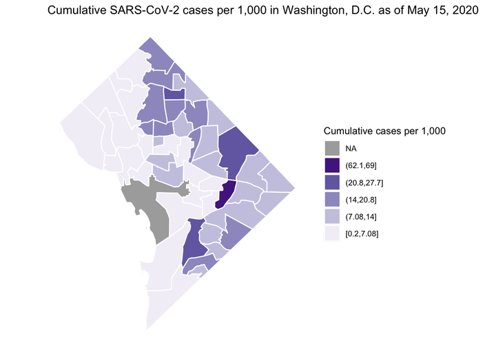 Image credit:
Ian Buller
Image credit:
Ian Buller
After moving to DC last year, PoPville has been a personal favorite for local scoop. A post on May 11, 2020 captured my attention. Molly Tolzmann zmotoly adjusted the daily coronavirus data publicly released by the DC Mayoral Office at the DC health planning neighborhood level by the 2018 American Community Survey (ACS) census tract data and demographic data from Open Data DC. This post is a replication of the data visualization using R and can be found on a public GitHub repository.
Important Notes:
- The following show cumulative case rate per 1,000 since the beginning of the COVID-19 outbreak in DC. Therefore, the the stats do not reflect the number of people currently infected with SARS-CoV-2.
- The following does not account for the degree of COVID-19 testing in each neighborhood.
The following are the necessary packages and settings for the exercise.
# Packages
loadedPackages <- c("dplyr", "ggplot2", "googlesheets4", "leaflet", "sf", "stringr", "widgetframe")
invisible(lapply(loadedPackages, require, character.only = T))

# Settings
gs4_deauth() # no Google authorization necessary because we are not reading a public repo
We import the District of Columbia
Health Planning Neighborhoods boundaries and Molly Tolzmann’s
zmotoly collation of the cumulative cases from start of the SARS-CoV-2 outbreak. The latter is hosted on a public
Google Sheet and is accessible in R using the
googlesheets4 package. After cleaning up the column names of the disease data, we merge the two data sets together and spatially project the polygons contained in the data to
EPSG:32618.
# District of Columbia Health Planning Neighborhoods
gis_path <- "https://opendata.arcgis.com/datasets/de63a68eb7674548ae0ac01867123f7e_13.geojson"
dc <- st_read(gis_path)
## Reading layer `DC_Health_Planning_Neighborhoods' from data source
##   `https://opendata.arcgis.com/datasets/de63a68eb7674548ae0ac01867123f7e_13.geojson'
##   using driver `GeoJSON'
## Simple feature collection with 51 features and 9 fields
## Geometry type: POLYGON
## Dimension:     XY
## Bounding box:  xmin: -77.11976 ymin: 38.79165 xmax: -76.9094 ymax: 38.99556
## Geodetic CRS:  WGS 84
# District of Columbia SAR-CoV-2 Data prepared by @zmotoly
covid_path <- "https://docs.google.com/spreadsheets/d/1u-FlJe2B1rYV0obEosHBks9utkU30-C2TSkHka6AVS8/edit#gid=1923705378"
covid <- read_sheet(
  ss = covid_path,
  sheet = 2, # second sheet
  skip = 2 # skip 1st row of annotation
)
names(covid) <- sub("\n", "", names(covid))   # remove extra line in column names
names(covid) <- gsub(" ", "_", names(covid))  # replace spaces with underscore

# Merge
dc_covid <- left_join(dc, covid, by = join_by("CODE" == "NB_Code"))

# Spatial Projection
## UTM zone 18N (Washington, DC)
dc_covid_proj <- st_transform(dc_covid, crs = 32618)
Static Map
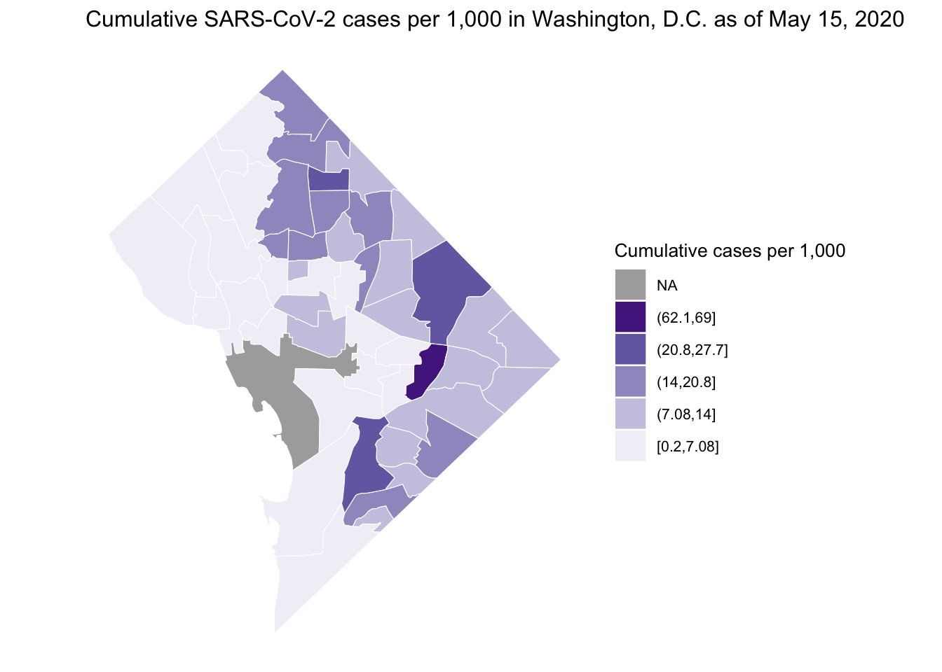
We can then plot the cumulative rate using various plotting techniques. Here, I demonstrate the ggplot2 package. We can customize our plot in various ways. Here I present cumulative cases per 1,000 (May 15, since start of the outbreak) choosing a non-alarmist color palette from ColorBrewer2.0.
## Plot of cumulative cases per 1,000
ggplot() +                                                    # initialize ggplot object
  geom_sf(                                                    # make a polygon
    data = dc_covid_proj,                                     # data frame
    aes(fill = cut_interval(Cases_per_1000_May_15, 10)),      # variable to use for filling
    colour = "white") +                                       # color of polygon borders
  scale_fill_brewer(
    "Cumulative cases per 1,000",         # title of colorkey
    palette = "Purples",                  # fill with brewer colors
    na.value = "grey67",                  # color for NA (The National Mall)
    direction = 1,                        # reverse colors in colorkey
    guide = guide_legend(reverse = T)) +  # reverse order of colokey
  ggtitle(
    "Cumulative SARS-CoV-2 cases per 1,000 in Washington, D.C. as of May 15, 2020"
  ) +                                     # add title
  theme(
    line = element_blank(),               # remove axis lines
    axis.text = element_blank(),          # remove tickmarks
    axis.title = element_blank(),         # remove axis labels
    panel.background = element_blank(),   # remove background gridlines
    text = element_text(size = 10)) +     # set font size
  coord_sf()                              # both axes the same scale
Interactive Map
In addition to a static map, the
leaflet package provides capabilities to create an interactive map with customizable features such as basemaps and overlapping layers. First, we need to spatially project the data to
EPSG:4326. We can also create custom popups when scrolling mouse over each neighborhood. Here, I use the same color palette as the static map and provide an example of the raw cumulative cases (May 15, 2020) in DC to demonstrate the layer overlapping feature of the leaflet package.
# Work with unprojected spatialpolygonsdataframe
## Project to WGS84 EPSG:4326
CoV_DC_WGS84 <- st_transform(dc_covid_proj, crs = 4326)

## Create Popups
dc_health <- str_to_title(CoV_DC_WGS84$Neighborhood_Name)
dc_health[c(11, 25, 41, 49)] <- c(
  "DC Medical Center", "GWU", "National Mall", "SW/Waterfront"
)
CoV_DC_WGS84$popup1 <- paste(
  dc_health,
  ": ",
  format(round(CoV_DC_WGS84$Total_cases_May_15, digits = 0), big.mark = ",", trim = T),
  " cumulative cases",
  sep = ""
)
CoV_DC_WGS84$popup2 <- paste(
  dc_health,
  ": ",
  format(round(CoV_DC_WGS84$Cases_per_1000_May_15, digits = 0), big.mark = ",", trim = T),
  " cumulative cases per 1,000",
  sep = ""
)

## Set Palettes
pal_cum <- colorNumeric(
  palette = "Purples",
  domain = CoV_DC_WGS84$Total_cases_May_15,
  na.color = "#555555"
)
pal_rate <- colorNumeric(
  palette = "Purples",
  domain = CoV_DC_WGS84$Cases_per_1000_May_15,
  na.color = "#555555"
)
The following is code for the leaflet plot. I set the starting parameters including available basemaps and then add each layer of COVID-19 data as polygons. After specifying the legend for each layer I finish up with a mini map to show scale.
## Create leaflet plot
lf <- leaflet(CoV_DC_WGS84) %>%                        # initial data
  setView(lng = -77, lat = 38.9, zoom = 11) %>%                  # starting coordinates
  addTiles() %>% # basemap
  addPolygons(
    data = CoV_DC_WGS84,
    color = "black",
    weight = 1,
    smoothFactor = 0.5,
    opacity = 1,
    fillOpacity = 0.67,
    fillColor = ~pal_cum(Total_cases_May_15),
    popup = ~popup1,
    highlightOptions = highlightOptions(color = "white", weight = 2, bringToFront = TRUE),
    group = "Cumulative Cases"
  ) %>%
  addPolygons(
    data = CoV_DC_WGS84,
    color = "black",
    weight = 1,
    smoothFactor = 0.5,
    opacity = 1,
    fillOpacity = 0.67,
    fillColor = ~pal_rate(Cases_per_1000_May_15),
    popup = ~popup2,
    highlightOptions = highlightOptions(color = "white", weight = 2, bringToFront = TRUE),
    group = "Cumulative Rate"
  ) %>%
  addLayersControl(
    overlayGroups = c("Cumulative Cases", "Cumulative Rate"), # layer selection
    options = layersControlOptions(collapsed = FALSE)
  ) %>%
  addLegend(
    "topright",
    pal = pal_cum,
    values = ~Total_cases_May_15,                  # legend for cases
    title = "Cumulative Cases",
    opacity = 1,
    group = "Cumulative Cases"
  ) %>%
  addLegend(
    "topright",
    pal = pal_rate,
    values = ~Cases_per_1000_May_15,              # legend for rate
    title = "Cumulative Rate per 1,000",
    opacity = 1,
    group = "Cumulative Rate"
  ) %>%
  hideGroup(c("Cumulative Cases", "Cumulative Rate")) %>% # no data shown (default)
  addMiniMap(position = "bottomleft") # add mini map

frameWidget(lf, width='100%')
As of May 15, 2020 the highest cumulative rate of SARS-CoV-2 cases have occurred in the Stadium Armory and Molly Tolzmann zmotoly noted the DC Jail is located in this neighborhood in her original post.
The provided maps are not intended to inform decision-making. Instead, I provide the the open-source code to download, manage, and visualize publicly available data. Future steps include linking other demographic information to each DC Health Planning Neighborhood (e.g., housing occupancy) and assessing their relationships with disease occurrence or creating an automatic workflow to update these figures daily.
Ian Buller, PhD, MA
Epidemiologist
I am a (geo)spatial statistician & environmental epidemiologist who primarily codes in R • All content is my own and does not represent my employer • he/him/his